When refracting using a red/green filter to check for over correction, why is a red/green filter used as opposed to a red/blue or red/purple which would make more sense. Is green not the center wavelength we're hoping to perfect?


When refracting using a red/green filter to check for over correction, why is a red/green filter used as opposed to a red/blue or red/purple which would make more sense. Is green not the center wavelength we're hoping to perfect?

Technically, yes, I'd think you were right. Green is not the extreme end, so if you balance, you'd get somewhere around yellow/orange.
I think the eye's most sensitive wavelength (in daytime) is 555 nm
I'm thinking that's why some fire trucks are that awful green color.
You'll see some RB anaglyph glasses for 3D vision as well as RG, so you're not too far off...blue would work.
However, I'm thinking that the luminance through a violet filter would be pretty low?
We do a lot of R-G tests, since they've been handed to us. Perhaps it's conventional, perhaps it's a practical thing.
For example we have red pass and green pass filters (as noted above) for visual training, the Worth dot test of binocular suppression, and more.
Another thought, though it's not very developed: what wavelength of light is used for refractive index standards? Is it yellow? Is there a relationship?
That was my thought, but then shouldnt everyone be refracting to give a 0.25 in the green instead of leaving both equal?Originally Posted by drk

No relationship I can think of.

I have no scientific or clinical reason for thinking this, but does it have something to do with the fact that red and green are opposite colors?? Just the first thing that came to mind.
:shrug:
It's nice to be important, but it's more important to be nice.
Visible light wavelength in nm
Color Wavelength
violet 380–450 nm
indigo 420–450 nm
blue 450–495 nm
green 495–570 nm
yellow 570–590 nm
orange 590–620 nm
red 620–750 nm
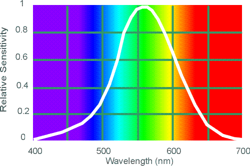
Green is the center, also shown on DRK's image below. If the chart below is correct ~400-700 is visible light which means the center of visible light is ~550 which again is green.
Last edited by braheem24; 10-29-2009 at 09:44 AM.
Your graphics are too simplistic.
They don't show correctly the subtle blend of colors.
In fact, 550 nm is yellow-green. About just in between yellow and green.
wavelength span symbol hue name
640 700 OR orange red
620 640 RO red orange
600 620 O orange
590 600 YO yellow orange
580 590 OY orange yellow
570 580 Y yellow
560 570 GY green yellow
530 560 YG yellow green
500 530 G green
490 500 BG blue green
480 490 GB green blue
460 480 B blue
440 460 VB violet blue
c560 440 BV blue violet
.... extraspectral hues ....
c530 c560 V violet
c510 c530 RV red violet
c490 c510 VR violet red
700 c490 R red
Note: Hue boundaries rounded to the nearest 10 nm. Spectral hue boundaries are arbitrary, due to the gradual blending of one hue into the next, the shifts in hue boundaries produced by luminance changes, individual differences in color perception, and language variation in the number and meaning of hue categories.
ref : http://www.handprint.com/HP/WCL/color1.html

For the FL of the human eye, the *dioptric* difference between red and green focus is 0.50D, therefore allowing a 0.25D (std) change permit the recognition of accomodative balance, vs. under or overcorrected (at 20 feet) easy to administer for most patients and refractionists.
Others?
Barry
I learned that for the most comfortable vision, luminous efficiency, yellow light should be on the retina.
Red and Green are equi-distant from yellow (wavelength, not colors), and when they are equi-distance from the retina (the patient will see both sides as 'equally clear'), then yellow light must be on the retina.
There may be something to do with the limitations of actual colors that the eye can see...
?
: )
Laurie
yellow-green is the wavelength that stimulate the largest number of cones, mostly green and red ones.
About the 0.50 difference : true
But the goal is still to set the focus at 550 nm for optimal vision.
And put a 0.25 difference both sides.
Depends on what shade of green or red you use.
Wonder if scientifics who chose those shades took that into consideration.
Nothing is perfect !
Why isn't simply YELLOW ??? ;););)
Or "sunshine in the mist" or "hepatitis skin color"
And chose between bloody red and jungle green.
Life is so complicated !
We teach the Red-Green or Duo-Chrome or Bi-Chrome Test as a monocular balancing technique based on the fact that is does place that 550 nm at or near the retina, and it is efficient (it works). I also include a 3-Click Blur technique, based on Egger's Chart logic that also assures patients are not over-minued. Blue is not used because of the scatter affect, which is commonly known, although I am not so sure that it would not work. The red-green has worked for many years and is an effective tool, so why change now? Comma is correct regarding the blended hues, so in reality there is some blue in affect.
I must say this is a very stimulating discussion, and it is appreciated.
I think Barry's explanation is most likely the reason the test is the way it is.
What if we used long-wavelength red and short-wavelength violet or blue, and the dioptric difference was -0.75? If we went to the exact midpoint, we'd be adding the dreaded 0.37 to everything!
In addition, the smaller the "depth of focus" (if you'll allow application of that phrase, here), the more precise the test. I run this test on each binocular refraction, and we typically get the response: "Red. Equal. Green." With an exaggerated depth of focus, we'd get "Red. Slightly red. Equal. Equal. Equal. Slightly purple. Purple." That's as bad as monochrome sphere checks!
So I think Barry's right.
But, I do think Braheem's right: If we were tricky enough, we'd have an "orange/bluegreen" test for better centering of the 555.
But we're dealing with Edwin Hubbles, not Hubble Space Telescopes.
Last edited by drk; 10-29-2009 at 09:36 PM.
Not necessarily. Not if the patient is an incipient presbyope who is currently under-corrected by .50 diopters "in the red", and their chief complaint is near vision strain.
Technically what you are suggesting is a very good endpoint to a refraction, but it often has to be tempered with other factors.
Agreed,
Practically I can't imagine how difficult it would be to administer a Red-Green or Green-Blue balance given that most patients will struggle to quickly notice a 0.50D difference.

The specific red and green filters used in the Duochrome test have been designed to produce dominant wavelengths that are around 0.50 D apart in a typical eye, so the color choices are not arbitrary at all (e.g., Courtoid Red 15 and Green 16). These filters have also been designed to produce nearly equal brightness. I believe these transmittance calculations are weighted by the spectral output of a standard incandescent (Tungsten) bulb, which shifts everything toward the red end of the spectrum. Lastly, remember that chromatic aberration of the eye doesn't necessarily vary linearly across the visible spectrum. The error increases more rapidly toward the blue end of the spectrum.
Last edited by Darryl Meister; 10-29-2009 at 11:26 PM.
Darryl J. Meister, ABOM

back to anatomy of the fovea, our center vision is most sensitive to red-green that where the cone of the receptor concentrate staying.. while rod more for the blue yellow.. so that why i think in order to have better light focus for the center vision they will need red-green as to refine the Rx..
Yeap
OPTICIAN............................................
Daryl is, as usual, very precise in his response to the thread. The particular hues he describes so aptly are well designed to place the appropriate yellow wavelength at or near the retina, but according to Borish, when the test was actually designed, it was due to the fact that the aberrations inherent in blue light rendered it not as effective. For this less than exact test, however, I do feel blur would probably work. It is a subjctive test with some level of variance due to the depth of focus described earlier. The red-green is a proven entity, and does quite nicely as a monocular balance.
Well I must say that this discussion is beyond my realm of expertise and has given me my next homework assignment.
Thanks for the interesting discussion guys!
There must be a bunch of old O.D.'s on here...... from back when they used to teach vision science in optometry school. LOL
OR decent opticians along with good ODs ;)
Thank you, Darryl, Laurie and others, for your contributions to this thread. It has improved my understanding of the optics involved immensely!
Barry

Hey dont forget the techs too!
Great thread...
Okay, how do we handle this when the patient is red and green color deficient? Do we streak or is the individual able to differentiate in gray tones?
:drop:
Red green color deficiency means that the individual cannot distinguish properly between red and geen hues. This will not affect the Duochrome test though, because the letters on one section or the other will still be blurred in the presence of a refractive error due to chromatic aberration, regardless of whether the patient can tell the colors apart. The patient may have to indicate the section instead of the color though.
Darryl J. Meister, ABOM
There are currently 1 users browsing this thread. (0 members and 1 guests)
 Posting Permissions

 Reply With Quote
Bookmarks